Showing posts with label modeling. Show all posts

Wednesday, August 25, 2010

Infinite Retirement Calculator

As you may know, I plan on living forever. Dying just seems so wasteful, so I think I'll skip that part of life. Living forever requires some planning, though. It'd be rather annoying to retire and then be forced back into the workforce at age 2718 because I ran out of money. Every retirement calculator I've ever found requires you to choose how long you will be retired. The longest option I've seen is 120 years, but even that's rather pessimistic. So then, I need to know how much money I need to save up in order to retire - forever. Alternatively, I'd like to know how much I can take out every year given my current investments.

I tried to be as conservative as possible in my planning. I assumed I would take out the entire year's spending money at the beginning of the year, i.e., I was pessimistic about how much of my net worth would grow each year. Of course, this pesky little recession has shown that I'm being ridiculously optimistic by assuming any sort of consistent growth during my retirement. Still, this is for planning purposes only, and certain assumptions have to be made in order to make the math at all reasonable.

So, without further ado, the calculator!

  • Modify either the "Net worth" or the "Max sustainable income" field and the other will be calculated.
  • "Growth rate" and "Inflation rate" are configurable as well.
  • The bold label indicates the calculated value.
Net worth ($):
Growth rate (%):
Inflation rate (%):
Max sustainable income ($):
Monthly values?

For every $0.00 you save, your eternal retirement income increases by $1.00.

Some following ado is in order. It should be noted that the "Net worth" and "Max sustainable income" values are in current dollars. The amount you withdraw is assumed to adjust for inflation each year; your infinite retirement should maintain a consistent quality of life. Since money equals happiness, this means your purchasing power should remain the same no matter how long you live. Similarly, the "Net worth" (when calculated) is how much you would need today in order to retire. The amount you need goes up each year, since your income requirements get larger as you postpone your retirement, but most of the difference should be accounted for in the principal growth that would be occurring. It should also be noted that the amount you have to save per dollar is entirely dependent on the growth and inflation rates, so these are rather important to estimate right (and/or conservatively).

Observant readers may have noticed that the default inflation rate of 3.3% closely matches the annualized inflation rate discussed previously. They may have also noticed that the default growth rate of 7% does NOT match any of the numbers in my discussion on the annualized growth rate. I chose 7% because this calculator models retirement, and people tend to be more conservative in their retirement. I think 7% is a better reflection of a portfolio with a significant percentage allocated to bonds, for example.

The "Net worth" label is probably a bit misleading, but it gives you a good place to start. I would probably not include my home equity in these calculations because I don't plan on using that for income in any way. Similarly, cash accounts won't come close to the average growth most people assume in their models, and would probably best be ignored. I would have used "Retirement savings" except that term is usually used to refer to 401(k) and IRA accounts, and regular taxable accounts can grow and produce income, too.

Growth and inflation rates are APY values. The default values reflect yearly budgeting, and for yearly values, APR=APY and things are simple. When the "Monthly values?" checkbox is checked, the growth and inflation rates are adjusted such that the APY remains the same as for the yearly case, other than rounding errors. When looking at monthly values, your overall income will still be higher (or your net worth needed lower) because you are leaving your money growing a few months longer.

Monday, August 23, 2010

Annualized S&P 500 Growth Rate

I talked before about the annualized inflation rate since 1913, and how this is a good number to use in modeling the future. This time, I'll be looking at the annualized return of the stock market as a representative of investments in general.

Once again, my efforts started by trying to find everything I needed online. I came much closer this time around than before. I found an excellent CAGR calculator for the S&P 500 going back to 1871. Again, this is good to get a final answer for a given time period, but I'd like the time period to be less arbitrary. The problem is that historic price data is readily available, but that doesn't include dividends. We really need data reflecting the total return seriously, visit this link - 44% of the total return is dividend reinvestment - amazing!). After a lot of searching for raw data, I found some detailed monthly data for the S&P 500 going back to 1970, much of which was reconstructed. While not raw, it's at least data!

The graph below (click for full size) shows the 1970-2009 data - individual monthly total returns, trailing 12-month total returns, trailing 20-year annualized total returns, and cumulative total returns since 01/1970. The overall total return from 1970-2009 was 9.44%-9.93% depending on what month you end on. The average 20-year annualized return was 13.31%, and the average 12-month return was 11.33%. It's not included in the graph or the table below, but the average 30-year annualized return over 1871-2009 was 9.36%, while the overall annualized return was 8.89% for that range. (NOTE: The average of a sliding window is not a great statistic - the time periods on each end are under-weighted. I include them because if any readers are like me, taking the average of a series of numbers is one of the first things you try to do. I am simply saving them a bit of work. ;)

For modeling my future investments, I use a more conservative 8% growth rate. However, I have a column in my spreadsheet that projects a 10% growth goal from when I first created it. Of course, the financial crisis and recession means I have a lot of catching up to do, even to my original 8% plan.

Display S&P 500 Data Table

Friday, August 20, 2010

Annualized Inflation

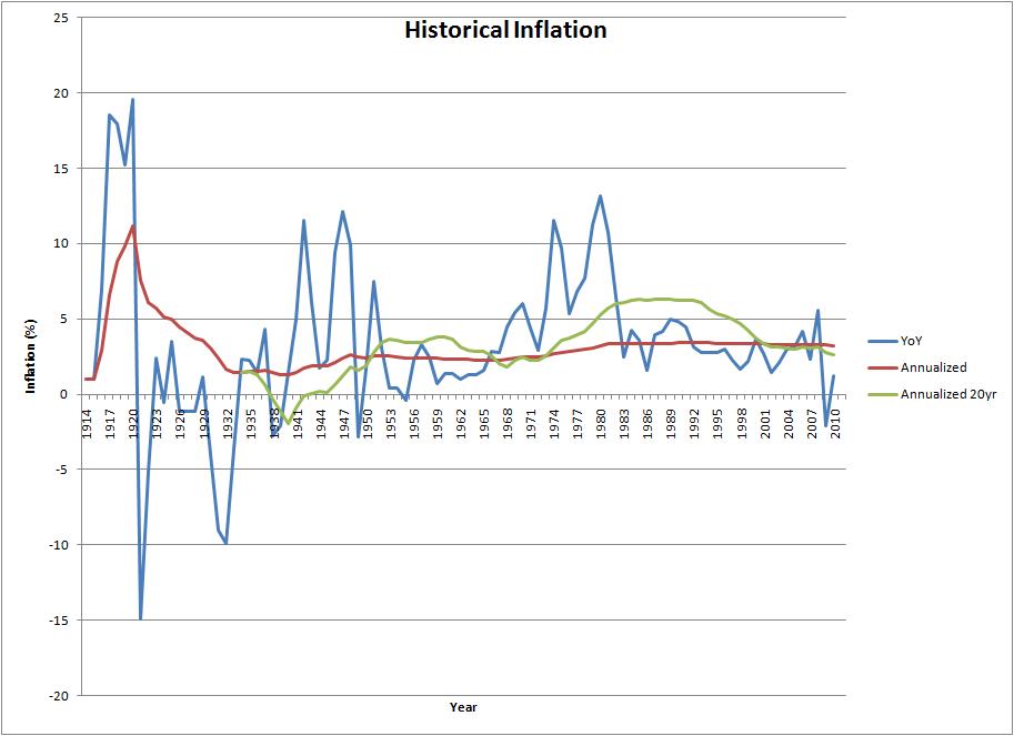
Knowing the current inflation rate is helpful in making short term decisions. Seeing a table of historical inflation rates is only slightly productive. For long term planning, what we're really interested in is the annualized inflation over a period of time. Sure, some years inflation may skyrocket to 20%, but other years it's flat or even negative. Taken together, they should be equivalent to one inflation rate applied each year. This annualized inflation rate (or geometric mean, or Compound Annual Growth Rate [CAGR]) is probably a good value to use when modeling inflation far into the future.

I found some great information over at InflationData.com, but I couldn't find any information on average or annualized inflation. I found a calculator at MeasuringWorth.com, but that also wasn't terribly useful except to give me a single final result. Then I found Peter Dolph on average inflation, but that was unclear whether it gave an average year-over-year inflation, which didn't make as much intuitive sense, or the geometric mean. So, I decided to compute it myself.

Since I love data, I started with the raw CPI data (see one of the tables below). I then computed the annualized inflation rate from 1913 up until each data point using the same month (or average, in the annual case) in each year. Looking at the table, things appeared to level out, so I decided to verify that with a graph! Not content with that, I then added the year-over-year inflation data for comparison purposes. Not content with that, I then computed and added a sliding 20-year window of annualized inflation rates.

The graph above (click for full size) shows the year-over-year inflation rate, a sliding 20-year annualized inflation rate, and an overall annualized inflation rate. Below, you can toggle between the raw CPI data and the overall annualized inflation rate table. The month of July was used for the graph for the simple reason that it was the most recent month data was available for this year. Also, the average 20-year annualized inflation rate was 3.236% compared to the overall annualized rate of 3.239% at the end of July, 2010, and compared to the 3.26% Peter Dolph found to be the average. Things seem to be pretty consistent.

"What about the risk of hyperinflation?" you may ask. Hyperinflation would indeed be bad, but I don't think it's particularly useful to worry about. If hyperinflation hits us, the world economy is likely completely broken and no amount of planning will help. You could argue that real goods like precious metals would hold their value, but I think owners of gold, for example, will have a hard time taking possession of that gold. Just a theory.

So, 3.3% is a pretty reasonable assumption for long term inflation, arrived at using various methods. This should give us some confidence when we create long term models and/or plans!

Display Annualized Inflation Table