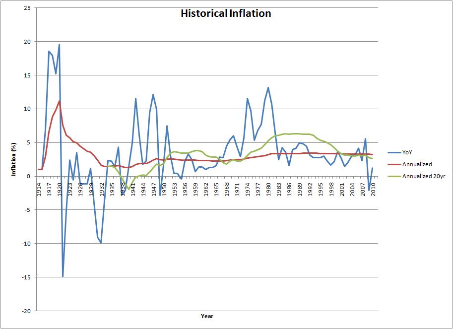
I talked before about the annualized inflation rate since 1913, and how this is a good number to use in modeling the future. This time, I'll be looking at the annualized return of the stock market as a representative of investments in general.
Once again, my efforts started by trying to find everything I needed online. I came much closer this time around than before. I found an excellent CAGR calculator for the S&P 500 going back to 1871. Again, this is good to get a final answer for a given time period, but I'd like the time period to be less arbitrary. The problem is that historic price data is readily available, but that doesn't include dividends. We really need data reflecting the total return seriously, visit this link - 44% of the total return is dividend reinvestment - amazing!). After a lot of searching for raw data, I found some detailed monthly data for the S&P 500 going back to 1970, much of which was reconstructed. While not raw, it's at least data!
The graph below (click for full size) shows the 1970-2009 data - individual monthly total returns, trailing 12-month total returns, trailing 20-year annualized total returns, and cumulative total returns since 01/1970. The overall total return from 1970-2009 was 9.44%-9.93% depending on what month you end on. The average 20-year annualized return was 13.31%, and the average 12-month return was 11.33%. It's not included in the graph or the table below, but the average 30-year annualized return over 1871-2009 was 9.36%, while the overall annualized return was 8.89% for that range. (NOTE: The average of a sliding window is not a great statistic - the time periods on each end are under-weighted. I include them because if any readers are like me, taking the average of a series of numbers is one of the first things you try to do. I am simply saving them a bit of work. ;)

For modeling my future investments, I use a more conservative 8% growth rate. However, I have a column in my spreadsheet that projects a 10% growth goal from when I first created it. Of course, the financial crisis and recession means I have a lot of catching up to do, even to my original 8% plan.
S&P 500 Data Table Display S&P 500 Data Table| Date | Total Value | 1-Month Total Return | 12-Month Total Return | 20-year Annualized | Annualized Total Return |
|---|---|---|---|---|---|
| 01/1970 | $85.28 | --- | --- | --- | --- |
| 02/1970 | $90.03 | 5.575% | --- | --- | --- |
| 03/1970 | $90.43 | 0.437% | --- | --- | --- |
| 04/1970 | $82.52 | -8.747% | --- | --- | --- |
| 05/1970 | $77.75 | -5.777% | --- | --- | --- |
| 06/1970 | $74.12 | -4.664% | --- | --- | --- |
| 07/1970 | $79.82 | 7.686% | --- | --- | --- |
| 08/1970 | $83.64 | 4.779% | --- | --- | --- |
| 09/1970 | $86.66 | 3.619% | --- | --- | --- |
| 10/1970 | $85.94 | -0.832% | --- | --- | --- |
| 11/1970 | $90.29 | 5.057% | --- | --- | --- |
| 12/1970 | $95.68 | 5.975% | --- | --- | --- |
| 01/1971 | $99.82 | 4.319% | 17.045% | --- | 17.045% |
| 02/1971 | $100.98 | 1.168% | 12.160% | --- | 16.883% |
| 03/1971 | $104.96 | 3.937% | 16.069% | --- | 19.478% |
| 04/1971 | $109.04 | 3.888% | 32.141% | --- | 21.727% |
| 05/1971 | $104.78 | -3.906% | 34.765% | --- | 16.701% |
| 06/1971 | $105.13 | 0.331% | 41.826% | --- | 15.915% |
| 07/1971 | $101.06 | -3.872% | 26.605% | --- | 11.981% |
| 08/1971 | $104.98 | 3.882% | 25.520% | --- | 14.027% |
| 09/1971 | $104.51 | -0.445% | 20.597% | --- | 12.978% |
| 10/1971 | $100.42 | -3.914% | 16.849% | --- | 9.790% |
| 11/1971 | $100.44 | 0.021% | 11.247% | --- | 9.337% |
| 12/1971 | $109.37 | 8.884% | 14.300% | --- | 13.859% |
| 01/1972 | $111.62 | 2.057% | 11.822% | --- | 14.404% |
| 02/1972 | $114.71 | 2.771% | 13.594% | --- | 15.292% |
| 03/1972 | $115.66 | 0.826% | 10.193% | --- | 15.099% |
| 04/1972 | $116.44 | 0.680% | 6.790% | --- | 14.847% |
| 05/1972 | $118.74 | 1.969% | 13.319% | --- | 15.239% |
| 06/1972 | $116.43 | -1.945% | 10.749% | --- | 13.749% |
| 07/1972 | $116.98 | 0.476% | 15.757% | --- | 13.477% |
| 08/1972 | $121.30 | 3.688% | 15.541% | --- | 14.610% |
| 09/1972 | $120.99 | -0.252% | 15.765% | --- | 14.015% |
| 10/1972 | $122.42 | 1.185% | 21.909% | --- | 14.050% |
| 11/1972 | $128.32 | 4.813% | 27.749% | --- | 15.511% |
| 12/1972 | $130.14 | 1.422% | 18.995% | --- | 15.594% |
| 01/1973 | $128.20 | -1.491% | 14.858% | --- | 14.555% |
| 02/1973 | $123.68 | -3.525% | 7.822% | --- | 12.814% |
| 03/1973 | $123.78 | 0.081% | 7.025% | --- | 12.486% |
| 04/1973 | $119.04 | -3.829% | 2.231% | --- | 10.807% |
| 05/1973 | $117.11 | -1.626% | -1.374% | --- | 9.981% |
| 06/1973 | $116.64 | -0.400% | 0.180% | --- | 9.597% |
| 07/1973 | $121.38 | 4.067% | 3.760% | --- | 10.611% |
| 08/1973 | $117.24 | -3.410% | -3.342% | --- | 9.289% |
| 09/1973 | $122.25 | 4.269% | 1.039% | --- | 10.319% |
| 10/1973 | $122.45 | 0.165% | 0.020% | --- | 10.127% |
| 11/1973 | $108.87 | -11.090% | -15.156% | --- | 6.578% |
| 12/1973 | $111.02 | 1.980% | -14.689% | --- | 6.967% |
| 01/1974 | $110.23 | -0.718% | -14.020% | --- | 6.625% |
| 02/1974 | $110.15 | -0.073% | -10.943% | --- | 6.467% |
| 03/1974 | $107.89 | -2.047% | -12.836% | --- | 5.807% |
| 04/1974 | $104.02 | -3.586% | -12.616% | --- | 4.786% |
| 05/1974 | $100.88 | -3.022% | -13.856% | --- | 3.953% |
| 06/1974 | $99.73 | -1.135% | -14.491% | --- | 3.608% |
| 07/1974 | $92.34 | -7.419% | -23.929% | --- | 1.782% |
| 08/1974 | $84.36 | -8.637% | -28.046% | --- | -0.236% |
| 09/1974 | $74.64 | -11.517% | -38.940% | --- | -2.814% |
| 10/1974 | $87.19 | 16.809% | -28.793% | --- | 0.468% |
| 11/1974 | $82.93 | -4.886% | -23.824% | --- | -0.576% |
| 12/1974 | $81.64 | -1.558% | -26.467% | --- | -0.884% |
| 01/1975 | $92.02 | 12.719% | -16.515% | --- | 1.534% |
| 02/1975 | $97.89 | 6.378% | -11.126% | --- | 2.750% |
| 03/1975 | $100.38 | 2.537% | -6.966% | --- | 3.205% |
| 04/1975 | $105.49 | 5.099% | 1.414% | --- | 4.135% |
| 05/1975 | $110.52 | 4.764% | 9.557% | --- | 4.981% |
| 06/1975 | $115.80 | 4.773% | 16.104% | --- | 5.810% |
| 07/1975 | $108.34 | -6.440% | 17.331% | --- | 4.447% |
| 08/1975 | $106.43 | -1.757% | 26.166% | --- | 4.048% |
| 09/1975 | $103.11 | -3.119% | 38.141% | --- | 3.408% |
| 10/1975 | $109.85 | 6.534% | 25.989% | --- | 4.502% |
| 11/1975 | $112.95 | 2.819% | 36.195% | --- | 4.935% |
| 12/1975 | $112.03 | -0.811% | 37.229% | --- | 4.719% |
| 01/1976 | $125.67 | 12.174% | 36.565% | --- | 6.675% |
| 02/1976 | $124.61 | -0.843% | 27.295% | --- | 6.433% |
| 03/1976 | $128.81 | 3.370% | 28.328% | --- | 6.916% |
| 04/1976 | $127.81 | -0.779% | 21.152% | --- | 6.688% |
| 05/1976 | $126.39 | -1.112% | 14.357% | --- | 6.409% |
| 06/1976 | $131.99 | 4.432% | 13.985% | --- | 7.044% |
| 07/1976 | $131.36 | -0.480% | 21.246% | --- | 6.872% |
| 08/1976 | $131.12 | -0.183% | 23.189% | --- | 6.752% |
| 09/1976 | $134.50 | 2.585% | 30.442% | --- | 7.074% |
| 10/1976 | $132.00 | -1.862% | 20.162% | --- | 6.686% |
| 11/1976 | $131.46 | -0.408% | 16.390% | --- | 6.538% |
| 12/1976 | $138.84 | 5.612% | 23.927% | --- | 7.300% |
| 01/1977 | $132.27 | -4.728% | 5.254% | --- | 6.471% |
| 02/1977 | $129.86 | -1.823% | 4.214% | --- | 6.117% |
| 03/1977 | $128.50 | -1.052% | -0.244% | --- | 5.887% |
| 04/1977 | $129.03 | 0.416% | 0.958% | --- | 5.878% |
| 05/1977 | $126.50 | -1.961% | 0.091% | --- | 5.524% |
| 06/1977 | $132.75 | 4.942% | 0.580% | --- | 6.149% |
| 07/1977 | $130.71 | -1.543% | -0.495% | --- | 5.859% |
| 08/1977 | $128.85 | -1.421% | -1.728% | --- | 5.593% |
| 09/1977 | $129.05 | 0.155% | -4.056% | --- | 5.552% |
| 10/1977 | $124.02 | -3.895% | -6.043% | --- | 4.951% |
| 11/1977 | $127.94 | 3.162% | -2.675% | --- | 5.315% |
| 12/1977 | $128.90 | 0.749% | -7.157% | --- | 5.357% |
| 01/1978 | $121.50 | -5.742% | -8.144% | --- | 4.524% |
| 02/1978 | $119.04 | -2.028% | -8.336% | --- | 4.212% |
| 03/1978 | $122.54 | 2.941% | -4.637% | --- | 4.539% |
| 04/1978 | $133.60 | 9.024% | 3.537% | --- | 5.592% |
| 05/1978 | $134.82 | 0.919% | 6.579% | --- | 5.650% |
| 06/1978 | $132.97 | -1.377% | 0.160% | --- | 5.419% |
| 07/1978 | $140.72 | 5.831% | 7.661% | --- | 6.069% |
| 08/1978 | $144.96 | 3.010% | 12.500% | --- | 6.375% |
| 09/1978 | $144.49 | -0.320% | 11.966% | --- | 6.273% |
| 10/1978 | $131.89 | -8.718% | 6.347% | --- | 5.110% |
| 11/1978 | $134.73 | 2.147% | 5.301% | --- | 5.313% |
| 12/1978 | $137.37 | 1.964% | 6.571% | --- | 5.492% |
| 01/1979 | $143.46 | 4.432% | 18.074% | --- | 5.949% |
| 02/1979 | $138.85 | -3.213% | 16.646% | --- | 5.513% |
| 03/1979 | $147.13 | 5.962% | 20.070% | --- | 6.130% |
| 04/1979 | $148.06 | 0.629% | 10.824% | --- | 6.145% |
| 05/1979 | $144.84 | -2.171% | 7.430% | --- | 5.840% |
| 06/1979 | $151.14 | 4.350% | 13.670% | --- | 6.266% |
| 07/1979 | $153.17 | 1.340% | 8.847% | --- | 6.358% |
| 08/1979 | $162.01 | 5.771% | 11.764% | --- | 6.925% |
| 09/1979 | $162.70 | 0.430% | 12.605% | --- | 6.911% |
| 10/1979 | $152.29 | -6.403% | 15.461% | --- | 6.127% |
| 11/1979 | $159.53 | 4.754% | 18.407% | --- | 6.576% |
| 12/1979 | $162.94 | 2.138% | 18.609% | --- | 6.746% |
| 01/1980 | $173.06 | 6.216% | 20.635% | --- | 7.334% |
| 02/1980 | $173.05 | -0.009% | 24.628% | --- | 7.270% |
| 03/1980 | $156.23 | -9.722% | 6.181% | --- | 6.135% |
| 04/1980 | $163.45 | 4.623% | 10.395% | --- | 6.553% |
| 05/1980 | $171.86 | 5.147% | 18.653% | --- | 7.017% |
| 06/1980 | $177.30 | 3.164% | 17.305% | --- | 7.279% |
| 07/1980 | $189.64 | 6.959% | 23.808% | --- | 7.908% |
| 08/1980 | $191.55 | 1.011% | 18.237% | --- | 7.946% |
| 09/1980 | $197.19 | 2.942% | 21.194% | --- | 8.175% |
| 10/1980 | $201.18 | 2.024% | 32.107% | --- | 8.311% |
| 11/1980 | $222.61 | 10.654% | 39.547% | --- | 9.261% |
| 12/1980 | $215.90 | -3.017% | 32.504% | --- | 8.881% |
| 01/1981 | $206.86 | -4.184% | 19.530% | --- | 8.389% |
| 02/1981 | $210.46 | 1.737% | 21.616% | --- | 8.492% |
| 03/1981 | $218.87 | 3.999% | 40.101% | --- | 8.807% |
| 04/1981 | $214.64 | -1.934% | 31.321% | --- | 8.551% |
| 05/1981 | $215.19 | 0.256% | 25.212% | --- | 8.510% |
| 06/1981 | $213.84 | -0.626% | 20.612% | --- | 8.385% |
| 07/1981 | $214.28 | 0.206% | 12.997% | --- | 8.341% |
| 08/1981 | $201.91 | -5.775% | 5.406% | --- | 7.724% |
| 09/1981 | $191.96 | -4.927% | -2.651% | --- | 7.202% |
| 10/1981 | $202.32 | 5.397% | 0.567% | --- | 7.630% |
| 11/1981 | $210.67 | 4.127% | -5.365% | --- | 7.942% |
| 12/1981 | $205.27 | -2.565% | -4.923% | --- | 7.649% |
| 01/1982 | $202.59 | -1.305% | -2.067% | --- | 7.477% |
| 02/1982 | $191.26 | -5.590% | -9.119% | --- | 6.913% |
| 03/1982 | $190.27 | -0.522% | -13.070% | --- | 6.818% |
| 04/1982 | $198.87 | 4.519% | -7.350% | --- | 7.156% |
| 05/1982 | $192.09 | -3.409% | -10.737% | --- | 6.805% |
| 06/1982 | $189.20 | -1.502% | -11.524% | --- | 6.628% |
| 07/1982 | $185.83 | -1.779% | -13.276% | --- | 6.430% |
| 08/1982 | $208.39 | 12.139% | 3.211% | --- | 7.359% |
| 09/1982 | $210.99 | 1.247% | 9.913% | --- | 7.414% |
| 10/1982 | $235.28 | 11.510% | 16.288% | --- | 8.285% |
| 11/1982 | $244.78 | 4.039% | 16.190% | --- | 8.563% |
| 12/1982 | $249.50 | 1.927% | 21.547% | --- | 8.666% |
| 01/1983 | $258.77 | 3.719% | 27.734% | --- | 8.914% |
| 02/1983 | $264.70 | 2.292% | 38.397% | --- | 9.043% |
| 03/1983 | $274.48 | 3.694% | 44.263% | --- | 9.284% |
| 04/1983 | $296.11 | 7.878% | 48.898% | --- | 9.850% |
| 05/1983 | $293.53 | -0.870% | 52.813% | --- | 9.714% |
| 06/1983 | $304.96 | 3.892% | 61.181% | --- | 9.963% |
| 07/1983 | $295.96 | -2.950% | 59.259% | --- | 9.655% |
| 08/1983 | $300.40 | 1.501% | 44.151% | --- | 9.713% |
| 09/1983 | $304.55 | 1.381% | 44.342% | --- | 9.761% |
| 10/1983 | $301.03 | -1.156% | 27.946% | --- | 9.607% |
| 11/1983 | $307.38 | 2.109% | 25.574% | --- | 9.712% |
| 12/1983 | $305.77 | -0.523% | 22.556% | --- | 9.609% |
| 01/1984 | $304.06 | -0.558% | 17.502% | --- | 9.506% |
| 02/1984 | $293.37 | -3.519% | 10.828% | --- | 9.169% |
| 03/1984 | $298.45 | 1.732% | 8.730% | --- | 9.245% |
| 04/1984 | $301.28 | 0.949% | 1.746% | --- | 9.261% |
| 05/1984 | $284.60 | -5.536% | -3.043% | --- | 8.772% |
| 06/1984 | $290.78 | 2.172% | -4.648% | --- | 8.881% |
| 07/1984 | $287.17 | -1.240% | -2.968% | --- | 8.734% |
| 08/1984 | $318.89 | 11.045% | 6.155% | --- | 9.466% |
| 09/1984 | $318.97 | 0.024% | 4.735% | --- | 9.411% |
| 10/1984 | $320.20 | 0.385% | 6.368% | --- | 9.384% |
| 11/1984 | $316.61 | -1.120% | 3.004% | --- | 9.246% |
| 12/1984 | $324.95 | 2.635% | 6.274% | --- | 9.383% |
| 01/1985 | $350.27 | 7.791% | 15.196% | --- | 9.876% |
| 02/1985 | $354.56 | 1.225% | 20.860% | --- | 9.908% |
| 03/1985 | $354.80 | 0.066% | 18.881% | --- | 9.855% |
| 04/1985 | $354.46 | -0.094% | 17.653% | --- | 9.792% |
| 05/1985 | $374.94 | 5.778% | 31.744% | --- | 10.139% |
| 06/1985 | $380.82 | 1.567% | 30.964% | --- | 10.193% |
| 07/1985 | $380.26 | -0.146% | 32.415% | --- | 10.125% |
| 08/1985 | $377.01 | -0.854% | 18.226% | --- | 10.008% |
| 09/1985 | $365.22 | -3.128% | 14.501% | --- | 9.729% |
| 10/1985 | $382.09 | 4.619% | 19.330% | --- | 9.990% |
| 11/1985 | $408.30 | 6.859% | 28.959% | --- | 10.397% |
| 12/1985 | $428.05 | 4.838% | 31.727% | --- | 10.667% |
| 01/1986 | $430.44 | 0.558% | 22.888% | --- | 10.647% |
| 02/1986 | $462.62 | 7.475% | 30.476% | --- | 11.086% |
| 03/1986 | $488.42 | 5.579% | 37.664% | --- | 11.400% |
| 04/1986 | $482.93 | -1.126% | 36.242% | --- | 11.260% |
| 05/1986 | $508.62 | 5.320% | 35.653% | --- | 11.553% |
| 06/1986 | $517.21 | 1.690% | 35.817% | --- | 11.605% |
| 07/1986 | $488.28 | -5.593% | 28.408% | --- | 11.155% |
| 08/1986 | $524.49 | 7.416% | 39.118% | --- | 11.576% |
| 09/1986 | $481.13 | -8.267% | 31.737% | --- | 10.939% |
| 10/1986 | $508.88 | 5.767% | 33.183% | --- | 11.254% |
| 11/1986 | $521.25 | 2.430% | 27.663% | --- | 11.354% |
| 12/1986 | $507.95 | -2.552% | 18.665% | --- | 11.125% |
| 01/1987 | $576.34 | 13.466% | 33.896% | --- | 11.896% |
| 02/1987 | $599.12 | 3.951% | 29.507% | --- | 12.088% |
| 03/1987 | $616.40 | 2.885% | 26.203% | --- | 12.212% |
| 04/1987 | $610.93 | -0.888% | 26.506% | --- | 12.092% |
| 05/1987 | $616.23 | 0.867% | 21.158% | --- | 12.086% |
| 06/1987 | $647.35 | 5.050% | 25.161% | --- | 12.342% |
| 07/1987 | $680.14 | 5.066% | 39.292% | --- | 12.597% |
| 08/1987 | $705.52 | 3.731% | 34.514% | --- | 12.769% |
| 09/1987 | $690.05 | -2.192% | 43.422% | --- | 12.564% |
| 10/1987 | $541.44 | -21.536% | 6.399% | --- | 10.974% |
| 11/1987 | $496.82 | -8.241% | -4.686% | --- | 10.387% |
| 12/1987 | $534.62 | 7.608% | 5.251% | --- | 10.788% |
| 01/1988 | $557.10 | 4.206% | -3.338% | --- | 10.990% |
| 02/1988 | $583.07 | 4.661% | -2.678% | --- | 11.216% |
| 03/1988 | $565.06 | -3.089% | -8.330% | --- | 10.970% |
| 04/1988 | $571.31 | 1.106% | -6.486% | --- | 10.984% |
| 05/1988 | $576.25 | 0.865% | -6.487% | --- | 10.984% |
| 06/1988 | $602.70 | 4.589% | -6.898% | --- | 11.202% |
| 07/1988 | $600.41 | -0.379% | -11.723% | --- | 11.126% |
| 08/1988 | $580.03 | -3.395% | -17.787% | --- | 10.867% |
| 09/1988 | $604.74 | 4.260% | -12.363% | --- | 11.064% |
| 10/1988 | $621.58 | 2.784% | 14.801% | --- | 11.175% |
| 11/1988 | $612.72 | -1.425% | 23.328% | --- | 11.038% |
| 12/1988 | $623.41 | 1.745% | 16.608% | --- | 11.089% |
| 01/1989 | $669.06 | 7.323% | 20.096% | --- | 11.451% |
| 02/1989 | $652.39 | -2.492% | 11.888% | --- | 11.251% |
| 03/1989 | $667.60 | 2.333% | 18.148% | --- | 11.334% |
| 04/1989 | $702.27 | 5.192% | 22.922% | --- | 11.575% |
| 05/1989 | $730.68 | 4.046% | 26.799% | --- | 11.751% |
| 06/1989 | $726.53 | -0.567% | 20.548% | --- | 11.665% |
| 07/1989 | $792.13 | 9.029% | 31.932% | --- | 12.108% |
| 08/1989 | $807.62 | 1.955% | 39.238% | --- | 12.165% |
| 09/1989 | $804.34 | -0.406% | 33.007% | --- | 12.087% |
| 10/1989 | $785.67 | -2.322% | 26.399% | --- | 11.900% |
| 11/1989 | $801.69 | 2.039% | 30.841% | --- | 11.961% |
| 12/1989 | $820.94 | 2.401% | 31.686% | --- | 12.042% |
| 01/1990 | $765.83 | -6.714% | 14.463% | 11.600% | 11.600% |
| 02/1990 | $775.69 | 1.288% | 18.901% | 11.369% | 11.620% |
| 03/1990 | $796.25 | 2.650% | 19.269% | 11.490% | 11.714% |
| 04/1990 | $776.38 | -2.495% | 10.554% | 11.860% | 11.524% |
| 05/1990 | $852.08 | 9.751% | 16.615% | 12.717% | 11.986% |
| 06/1990 | $846.33 | -0.675% | 16.489% | 12.948% | 11.897% |
| 07/1990 | $843.62 | -0.321% | 6.500% | 12.513% | 11.828% |
| 08/1990 | $767.36 | -9.039% | -4.984% | 11.720% | 11.264% |
| 09/1990 | $730.02 | -4.867% | -9.240% | 11.244% | 10.948% |
| 10/1990 | $726.91 | -0.426% | -7.478% | 11.266% | 10.879% |
| 11/1990 | $773.90 | 6.464% | -3.466% | 11.340% | 11.167% |
| 12/1990 | $795.46 | 2.786% | -3.104% | 11.170% | 11.266% |
| 01/1991 | $830.10 | 4.355% | 8.393% | 11.172% | 11.445% |
| 02/1991 | $889.46 | 7.152% | 14.667% | 11.492% | 11.763% |
| 03/1991 | $911.00 | 2.422% | 14.412% | 11.410% | 11.840% |
| 04/1991 | $913.16 | 0.237% | 17.618% | 11.211% | 11.804% |
| 05/1991 | $952.55 | 4.314% | 11.791% | 11.668% | 11.977% |
| 06/1991 | $908.91 | -4.581% | 7.394% | 11.389% | 11.682% |
| 07/1991 | $951.28 | 4.661% | 12.761% | 11.863% | 11.871% |
| 08/1991 | $973.82 | 2.369% | 26.904% | 11.781% | 11.944% |
| 09/1991 | $957.52 | -1.674% | 31.163% | 11.712% | 11.809% |
| 10/1991 | $970.39 | 1.344% | 33.495% | 12.010% | 11.829% |
| 11/1991 | $931.29 | -4.029% | 20.338% | 11.779% | 11.571% |
| 12/1991 | $1,037.80 | 11.437% | 30.466% | 11.908% | 12.077% |
| 01/1992 | $1,018.46 | -1.863% | 22.692% | 11.689% | 11.933% |
| 02/1992 | $1,031.65 | 1.295% | 15.986% | 11.608% | 11.951% |
| 03/1992 | $1,011.59 | -1.945% | 11.041% | 11.453% | 11.804% |
| 04/1992 | $1,041.34 | 2.941% | 14.037% | 11.577% | 11.903% |
| 05/1992 | $1,046.44 | 0.490% | 9.857% | 11.495% | 11.881% |
| 06/1992 | $1,030.88 | -1.488% | 13.418% | 11.521% | 11.759% |
| 07/1992 | $1,072.99 | 4.085% | 12.794% | 11.718% | 11.912% |
| 08/1992 | $1,051.03 | -2.047% | 7.929% | 11.401% | 11.763% |
| 09/1992 | $1,063.38 | 1.175% | 11.056% | 11.480% | 11.775% |
| 10/1992 | $1,067.05 | 0.345% | 9.961% | 11.434% | 11.747% |
| 11/1992 | $1,103.39 | 3.405% | 18.479% | 11.358% | 11.865% |
| 12/1992 | $1,116.93 | 1.227% | 7.624% | 11.348% | 11.879% |
| 01/1993 | $1,126.21 | 0.831% | 10.580% | 11.477% | 11.874% |
| 02/1993 | $1,141.56 | 1.363% | 10.654% | 11.753% | 11.894% |
| 03/1993 | $1,165.65 | 2.110% | 15.230% | 11.865% | 11.950% |
| 04/1993 | $1,137.47 | -2.417% | 9.232% | 11.947% | 11.787% |
| 05/1993 | $1,167.90 | 2.675% | 11.607% | 12.187% | 11.869% |
| 06/1993 | $1,171.32 | 0.293% | 13.624% | 12.226% | 11.838% |
| 07/1993 | $1,166.61 | -0.402% | 8.725% | 11.980% | 11.775% |
| 08/1993 | $1,210.87 | 3.794% | 15.208% | 12.383% | 11.907% |
| 09/1993 | $1,201.59 | -0.767% | 12.997% | 12.105% | 11.827% |
| 10/1993 | $1,226.44 | 2.069% | 14.938% | 12.211% | 11.879% |
| 11/1993 | $1,214.74 | -0.954% | 10.092% | 12.818% | 11.790% |
| 12/1993 | $1,229.43 | 1.209% | 10.072% | 12.775% | 11.803% |
| 01/1994 | $1,271.22 | 3.400% | 12.876% | 13.005% | 11.916% |
| 02/1994 | $1,236.72 | -2.714% | 8.336% | 12.853% | 11.744% |
| 03/1994 | $1,182.80 | -4.360% | 1.472% | 12.719% | 11.496% |
| 04/1994 | $1,197.97 | 1.282% | 5.319% | 12.997% | 11.513% |
| 05/1994 | $1,217.63 | 1.641% | 4.258% | 13.262% | 11.546% |
| 06/1994 | $1,187.78 | -2.451% | 1.405% | 13.187% | 11.391% |
| 07/1994 | $1,226.79 | 3.284% | 5.158% | 13.807% | 11.497% |
| 08/1994 | $1,277.08 | 4.100% | 5.468% | 14.552% | 11.638% |
| 09/1994 | $1,245.85 | -2.445% | 3.684% | 15.113% | 11.484% |
| 10/1994 | $1,273.84 | 2.247% | 3.865% | 14.349% | 11.544% |
| 11/1994 | $1,227.45 | -3.642% | 1.046% | 14.423% | 11.336% |
| 12/1994 | $1,245.66 | 1.484% | 1.320% | 14.597% | 11.362% |
| 01/1995 | $1,277.96 | 2.593% | 0.530% | 14.059% | 11.436% |
| 02/1995 | $1,327.77 | 3.897% | 7.362% | 13.925% | 11.566% |
| 03/1995 | $1,366.95 | 2.951% | 15.569% | 13.948% | 11.655% |
| 04/1995 | $1,407.20 | 2.945% | 17.465% | 13.830% | 11.742% |
| 05/1995 | $1,463.44 | 3.997% | 20.188% | 13.788% | 11.875% |
| 06/1995 | $1,497.43 | 2.323% | 26.070% | 13.654% | 11.934% |
| 07/1995 | $1,547.09 | 3.316% | 26.109% | 14.219% | 12.037% |
| 08/1995 | $1,550.98 | 0.251% | 21.447% | 14.334% | 12.006% |
| 09/1995 | $1,616.44 | 4.220% | 29.745% | 14.752% | 12.145% |
| 10/1995 | $1,610.66 | -0.357% | 26.441% | 14.369% | 12.088% |
| 11/1995 | $1,681.36 | 4.390% | 36.981% | 14.456% | 12.233% |
| 12/1995 | $1,713.75 | 1.926% | 37.578% | 14.612% | 12.274% |
| 01/1996 | $1,772.08 | 3.404% | 38.664% | 14.146% | 12.377% |
| 02/1996 | $1,788.51 | 0.927% | 34.701% | 14.247% | 12.375% |
| 03/1996 | $1,805.72 | 0.963% | 32.099% | 14.113% | 12.374% |
| 04/1996 | $1,832.35 | 1.474% | 30.212% | 14.241% | 12.396% |
| 05/1996 | $1,879.60 | 2.579% | 28.437% | 14.451% | 12.463% |
| 06/1996 | $1,886.77 | 0.382% | 26.001% | 14.224% | 12.437% |
| 07/1996 | $1,803.42 | -4.418% | 16.568% | 13.994% | 12.204% |
| 08/1996 | $1,841.46 | 2.109% | 18.728% | 14.124% | 12.252% |
| 09/1996 | $1,945.10 | 5.628% | 20.333% | 14.291% | 12.442% |
| 10/1996 | $1,998.75 | 2.758% | 24.095% | 14.554% | 12.515% |
| 11/1996 | $2,149.83 | 7.559% | 27.862% | 14.995% | 12.780% |
| 12/1996 | $2,107.23 | -1.981% | 22.960% | 14.567% | 12.654% |
| 01/1997 | $2,238.88 | 6.248% | 26.342% | 15.193% | 12.866% |
| 02/1997 | $2,256.43 | 0.784% | 26.163% | 15.344% | 12.856% |
| 03/1997 | $2,163.72 | -4.109% | 19.825% | 15.164% | 12.640% |
| 04/1997 | $2,292.89 | 5.970% | 25.134% | 15.474% | 12.839% |
| 05/1997 | $2,432.49 | 6.088% | 29.415% | 15.930% | 13.042% |
| 06/1997 | $2,541.47 | 4.480% | 34.699% | 15.905% | 13.180% |
| 07/1997 | $2,743.68 | 7.957% | 52.138% | 16.440% | 13.453% |
| 08/1997 | $2,589.98 | -5.602% | 40.648% | 16.188% | 13.173% |
| 09/1997 | $2,731.82 | 5.477% | 40.446% | 16.489% | 13.349% |
| 10/1997 | $2,640.59 | -3.340% | 32.112% | 16.523% | 13.168% |
| 11/1997 | $2,762.83 | 4.629% | 28.514% | 16.605% | 13.310% |
| 12/1997 | $2,810.27 | 1.717% | 33.363% | 16.661% | 13.337% |
| 01/1998 | $2,841.36 | 1.106% | 26.910% | 17.070% | 13.340% |
| 02/1998 | $3,046.29 | 7.213% | 35.005% | 17.599% | 13.579% |
| 03/1998 | $3,202.29 | 5.121% | 47.999% | 17.722% | 13.737% |
| 04/1998 | $3,234.50 | 1.006% | 41.067% | 17.274% | 13.735% |
| 05/1998 | $3,178.91 | -1.719% | 30.686% | 17.119% | 13.622% |
| 06/1998 | $3,308.03 | 4.062% | 30.162% | 17.433% | 13.739% |
| 07/1998 | $3,272.81 | -1.065% | 19.285% | 17.038% | 13.653% |
| 08/1998 | $2,799.63 | -14.458% | 8.095% | 15.956% | 12.992% |
| 09/1998 | $2,978.98 | 6.406% | 9.047% | 16.335% | 13.197% |
| 10/1998 | $3,221.30 | 8.134% | 21.992% | 17.325% | 13.464% |
| 11/1998 | $3,416.53 | 6.061% | 23.661% | 17.546% | 13.654% |
| 12/1998 | $3,613.41 | 5.763% | 28.579% | 17.761% | 13.833% |
| 01/1999 | $3,764.51 | 4.182% | 32.490% | 17.747% | 13.951% |
| 02/1999 | $3,647.51 | -3.108% | 19.736% | 17.753% | 13.785% |
| 03/1999 | $3,793.44 | 4.001% | 18.460% | 17.643% | 13.896% |
| 04/1999 | $3,940.35 | 3.873% | 21.822% | 17.830% | 14.002% |
| 05/1999 | $3,847.30 | -2.361% | 21.026% | 17.818% | 13.867% |
| 06/1999 | $4,060.82 | 5.550% | 22.756% | 17.886% | 14.034% |
| 07/1999 | $3,934.02 | -3.122% | 20.203% | 17.621% | 13.869% |
| 08/1999 | $3,914.56 | -0.495% | 39.824% | 17.262% | 13.809% |
| 09/1999 | $3,807.24 | -2.741% | 27.804% | 17.074% | 13.661% |
| 10/1999 | $4,048.17 | 6.328% | 25.669% | 17.823% | 13.854% |
| 11/1999 | $4,130.46 | 2.033% | 20.896% | 17.668% | 13.890% |
| 12/1999 | $4,373.73 | 5.890% | 21.042% | 17.880% | 14.067% |
| 01/2000 | $4,153.98 | -5.024% | 10.346% | 17.223% | 13.829% |
| 02/2000 | $4,075.35 | -1.893% | 11.730% | 17.112% | 13.716% |
| 03/2000 | $4,474.03 | 9.783% | 17.941% | 18.263% | 14.028% |
| 04/2000 | $4,339.43 | -3.009% | 10.128% | 17.816% | 13.872% |
| 05/2000 | $4,250.40 | -2.052% | 10.477% | 17.399% | 13.753% |
| 06/2000 | $4,355.18 | 2.465% | 7.249% | 17.359% | 13.804% |
| 07/2000 | $4,287.09 | -1.563% | 8.975% | 16.872% | 13.705% |
| 08/2000 | $4,553.38 | 6.211% | 16.319% | 17.166% | 13.890% |
| 09/2000 | $4,312.99 | -5.279% | 13.284% | 16.680% | 13.648% |
| 10/2000 | $4,294.76 | -0.423% | 6.091% | 16.538% | 13.593% |
| 11/2000 | $3,956.16 | -7.884% | -4.220% | 15.475% | 13.252% |
| 12/2000 | $3,975.53 | 0.489% | -9.104% | 15.680% | 13.232% |
| 01/2001 | $4,116.57 | 3.548% | -0.900% | 16.130% | 13.322% |
| 02/2001 | $3,741.22 | -9.118% | -8.199% | 15.476% | 12.936% |
| 03/2001 | $3,504.21 | -6.335% | -21.677% | 14.874% | 12.662% |
| 04/2001 | $3,776.52 | 7.771% | -12.972% | 15.417% | 12.896% |
| 05/2001 | $3,801.83 | 0.670% | -10.554% | 15.441% | 12.884% |
| 06/2001 | $3,709.29 | -2.434% | -14.830% | 15.335% | 12.759% |
| 07/2001 | $3,672.78 | -0.984% | -14.329% | 15.266% | 12.688% |
| 08/2001 | $3,442.86 | -6.260% | -24.389% | 15.236% | 12.422% |
| 09/2001 | $3,164.84 | -8.075% | -26.621% | 15.042% | 12.089% |
| 10/2001 | $3,225.19 | 1.907% | -24.904% | 14.849% | 12.122% |
| 11/2001 | $3,472.58 | 7.671% | -12.224% | 15.041% | 12.349% |
| 12/2001 | $3,503.00 | 0.876% | -11.886% | 15.241% | 12.346% |
| 01/2002 | $3,451.88 | -1.459% | -16.147% | 15.232% | 12.260% |
| 02/2002 | $3,385.31 | -1.929% | -9.513% | 15.451% | 12.158% |
| 03/2002 | $3,512.63 | 3.761% | 0.240% | 15.695% | 12.254% |
| 04/2002 | $3,299.67 | -6.063% | -12.627% | 15.079% | 12.003% |
| 05/2002 | $3,275.36 | -0.737% | -13.848% | 15.236% | 11.944% |
| 06/2002 | $3,042.02 | -7.124% | -17.989% | 14.898% | 11.657% |
| 07/2002 | $2,804.91 | -7.795% | -23.630% | 14.535% | 11.347% |
| 08/2002 | $2,823.33 | 0.657% | -17.995% | 13.918% | 11.339% |
| 09/2002 | $2,516.49 | -10.868% | -20.486% | 13.195% | 10.917% |
| 10/2002 | $2,737.98 | 8.802% | -15.106% | 13.056% | 11.174% |
| 11/2002 | $2,899.14 | 5.886% | -16.513% | 13.155% | 11.338% |
| 12/2002 | $2,728.82 | -5.875% | -22.101% | 12.706% | 11.103% |
| 01/2003 | $2,657.33 | -2.620% | -23.018% | 12.351% | 10.984% |
| 02/2003 | $2,617.46 | -1.500% | -22.682% | 12.139% | 10.904% |
| 03/2003 | $2,642.88 | 0.971% | -24.761% | 11.990% | 10.908% |
| 04/2003 | $2,860.57 | 8.237% | -13.307% | 12.008% | 11.143% |
| 05/2003 | $3,011.29 | 5.269% | -8.062% | 12.345% | 11.285% |
| 06/2003 | $3,049.70 | 1.276% | 0.252% | 12.202% | 11.298% |
| 07/2003 | $3,103.47 | 1.763% | 10.644% | 12.468% | 11.326% |
| 08/2003 | $3,164.00 | 1.950% | 12.066% | 12.493% | 11.361% |
| 09/2003 | $3,130.40 | -1.062% | 24.395% | 12.356% | 11.296% |
| 10/2003 | $3,307.48 | 5.657% | 20.800% | 12.731% | 11.448% |
| 11/2003 | $3,336.58 | 0.880% | 15.089% | 12.663% | 11.447% |
| 12/2003 | $3,511.57 | 5.244% | 28.685% | 12.981% | 11.585% |
| 01/2004 | $3,576.02 | 1.835% | 34.572% | 13.115% | 11.615% |
| 02/2004 | $3,625.73 | 1.390% | 38.521% | 13.396% | 11.630% |
| 03/2004 | $3,571.02 | -1.509% | 35.118% | 13.213% | 11.551% |
| 04/2004 | $3,514.95 | -1.570% | 22.876% | 13.070% | 11.469% |
| 05/2004 | $3,563.18 | 1.372% | 18.327% | 13.470% | 11.484% |
| 06/2004 | $3,632.44 | 1.944% | 19.108% | 13.457% | 11.517% |
| 07/2004 | $3,512.21 | -3.310% | 13.170% | 13.337% | 11.379% |
| 08/2004 | $3,526.36 | 0.403% | 11.453% | 12.768% | 11.363% |
| 09/2004 | $3,564.56 | 1.083% | 13.869% | 12.827% | 11.369% |
| 10/2004 | $3,619.02 | 1.528% | 9.419% | 12.891% | 11.389% |
| 11/2004 | $3,765.45 | 4.046% | 12.853% | 13.179% | 11.487% |
| 12/2004 | $3,893.59 | 3.403% | 10.879% | 13.221% | 11.565% |
| 01/2005 | $3,798.68 | -2.438% | 6.226% | 12.658% | 11.457% |
| 02/2005 | $3,878.60 | 2.104% | 6.974% | 12.707% | 11.495% |
| 03/2005 | $3,809.91 | -1.771% | 6.690% | 12.602% | 11.409% |
| 04/2005 | $3,737.53 | -1.900% | 6.332% | 12.500% | 11.320% |
| 05/2005 | $3,856.45 | 3.182% | 8.231% | 12.360% | 11.391% |
| 06/2005 | $3,861.93 | 0.142% | 6.318% | 12.281% | 11.367% |
| 07/2005 | $4,005.55 | 3.719% | 14.047% | 12.494% | 11.453% |
| 08/2005 | $3,969.02 | -0.912% | 12.553% | 12.491% | 11.396% |
| 09/2005 | $4,001.17 | 0.810% | 12.249% | 12.715% | 11.394% |
| 10/2005 | $3,934.47 | -1.667% | 8.716% | 12.366% | 11.313% |
| 11/2005 | $4,083.28 | 3.782% | 8.441% | 12.202% | 11.401% |
| 12/2005 | $4,084.66 | 0.034% | 4.908% | 11.939% | 11.374% |
| 01/2006 | $4,192.83 | 2.648% | 10.376% | 12.055% | 11.427% |
| 02/2006 | $4,204.19 | 0.271% | 8.394% | 11.667% | 11.408% |
| 03/2006 | $4,256.53 | 1.245% | 11.722% | 11.433% | 11.418% |
| 04/2006 | $4,313.70 | 1.343% | 15.416% | 11.570% | 11.431% |
| 05/2006 | $4,189.55 | -2.878% | 8.637% | 11.119% | 11.314% |
| 06/2006 | $4,195.25 | 0.136% | 8.631% | 11.034% | 11.291% |
| 07/2006 | $4,221.13 | 0.617% | 5.382% | 11.388% | 11.283% |
| 08/2006 | $4,321.59 | 2.380% | 8.883% | 11.121% | 11.327% |
| 09/2006 | $4,432.96 | 2.577% | 10.792% | 11.743% | 11.377% |
| 10/2006 | $4,577.43 | 3.259% | 16.342% | 11.609% | 11.447% |
| 11/2006 | $4,664.49 | 1.902% | 14.234% | 11.580% | 11.477% |
| 12/2006 | $4,729.94 | 1.403% | 15.797% | 11.803% | 11.491% |
| 01/2007 | $4,801.45 | 1.512% | 14.516% | 11.182% | 11.509% |
| 02/2007 | $4,707.54 | -1.956% | 11.973% | 10.857% | 11.423% |
| 03/2007 | $4,760.17 | 1.118% | 11.832% | 10.761% | 11.429% |
| 04/2007 | $4,971.04 | 4.430% | 15.239% | 11.051% | 11.532% |
| 05/2007 | $5,144.53 | 3.490% | 22.794% | 11.194% | 11.607% |
| 06/2007 | $5,059.13 | -1.660% | 20.592% | 10.827% | 11.530% |
| 07/2007 | $4,902.30 | -3.100% | 16.137% | 10.380% | 11.409% |
| 08/2007 | $4,975.78 | 1.499% | 15.138% | 10.260% | 11.427% |
| 09/2007 | $5,161.88 | 3.740% | 16.443% | 10.585% | 11.509% |
| 10/2007 | $5,244.00 | 1.591% | 14.562% | 12.023% | 11.528% |
| 11/2007 | $5,024.75 | -4.181% | 7.723% | 12.265% | 11.376% |
| 12/2007 | $4,989.88 | -0.694% | 5.496% | 11.816% | 11.329% |
| 01/2008 | $4,690.59 | -5.998% | -2.309% | 11.241% | 11.122% |
| 02/2008 | $4,538.19 | -3.249% | -3.597% | 10.805% | 11.000% |
| 03/2008 | $4,518.68 | -0.430% | -5.073% | 10.955% | 10.962% |
| 04/2008 | $4,738.74 | 4.870% | -4.673% | 11.158% | 11.075% |
| 05/2008 | $4,800.12 | 1.295% | -6.695% | 11.181% | 11.087% |
| 06/2008 | $4,395.47 | -8.430% | -13.118% | 10.445% | 10.807% |
| 07/2008 | $4,358.50 | -0.841% | -11.093% | 10.419% | 10.758% |
| 08/2008 | $4,421.52 | 1.446% | -11.139% | 10.689% | 10.775% |
| 09/2008 | $4,027.53 | -8.911% | -21.975% | 9.945% | 10.484% |
| 10/2008 | $3,351.11 | -16.795% | -36.096% | 8.789% | 9.937% |
| 11/2008 | $3,110.67 | -7.175% | -38.093% | 8.463% | 9.704% |
| 12/2008 | $3,143.76 | 1.064% | -36.997% | 8.426% | 9.712% |
| 01/2009 | $2,878.79 | -8.429% | -38.626% | 7.569% | 9.443% |
| 02/2009 | $2,572.26 | -10.648% | -43.320% | 7.100% | 9.107% |
| 03/2009 | $2,797.58 | 8.759% | -38.089% | 7.427% | 9.321% |
| 04/2009 | $3,065.33 | 9.571% | -35.313% | 7.646% | 9.555% |
| 05/2009 | $3,236.79 | 5.593% | -32.569% | 7.726% | 9.686% |
| 06/2009 | $3,243.21 | 0.198% | -26.215% | 7.767% | 9.670% |
| 07/2009 | $3,488.51 | 7.564% | -19.961% | 7.694% | 9.851% |
| 08/2009 | $3,614.45 | 3.610% | -18.253% | 7.781% | 9.928% |
| 09/2009 | $3,749.27 | 3.730% | -6.909% | 8.000% | 10.008% |
| 10/2009 | $3,679.62 | -1.858% | 9.803% | 8.026% | 9.934% |